Steak ‘n Shake
In one of my first big creative undertakings, I and five other Strategic Communications majors formed 26 and Co., our own student-run ad agency, and developed a full campaign for a Steak 'N Shake rebrand. As head copywriter, my responsibilities included writing copy for the brand and logo usage standards, developing a line of print ads, and co-writing the script and storyboard for a 30-second TV spot. Beyond the creative work, I coordinated closely with our account manager, PR specialist, and art directors to keep the campaign moving on schedule.
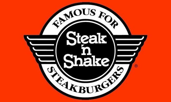
The rebrand was one of the more considered creative decisions of the project. Steak 'N Shake is known for having one of the most iconic logos in the food industry, which is why we retained the signature wings and classic red, white, and black color scheme. Then, to expand on that, we updated the typography to reference classic American diner imagery rather than replacing what made the brand recognizable in the first place.
You can view our team logo and our brand logo and usage standards below.

